CASE STUDY
Travel Rewards
Travel Rewards points for pursuing your desired activities. Explore novel destinations and acquire travel merchandise to elevate your journey. Additionally, you can conveniently store all your loyalty cards digitally, minimizing the need to carry physical cards.
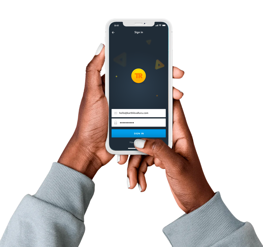
From initial sketches to ultimate designs
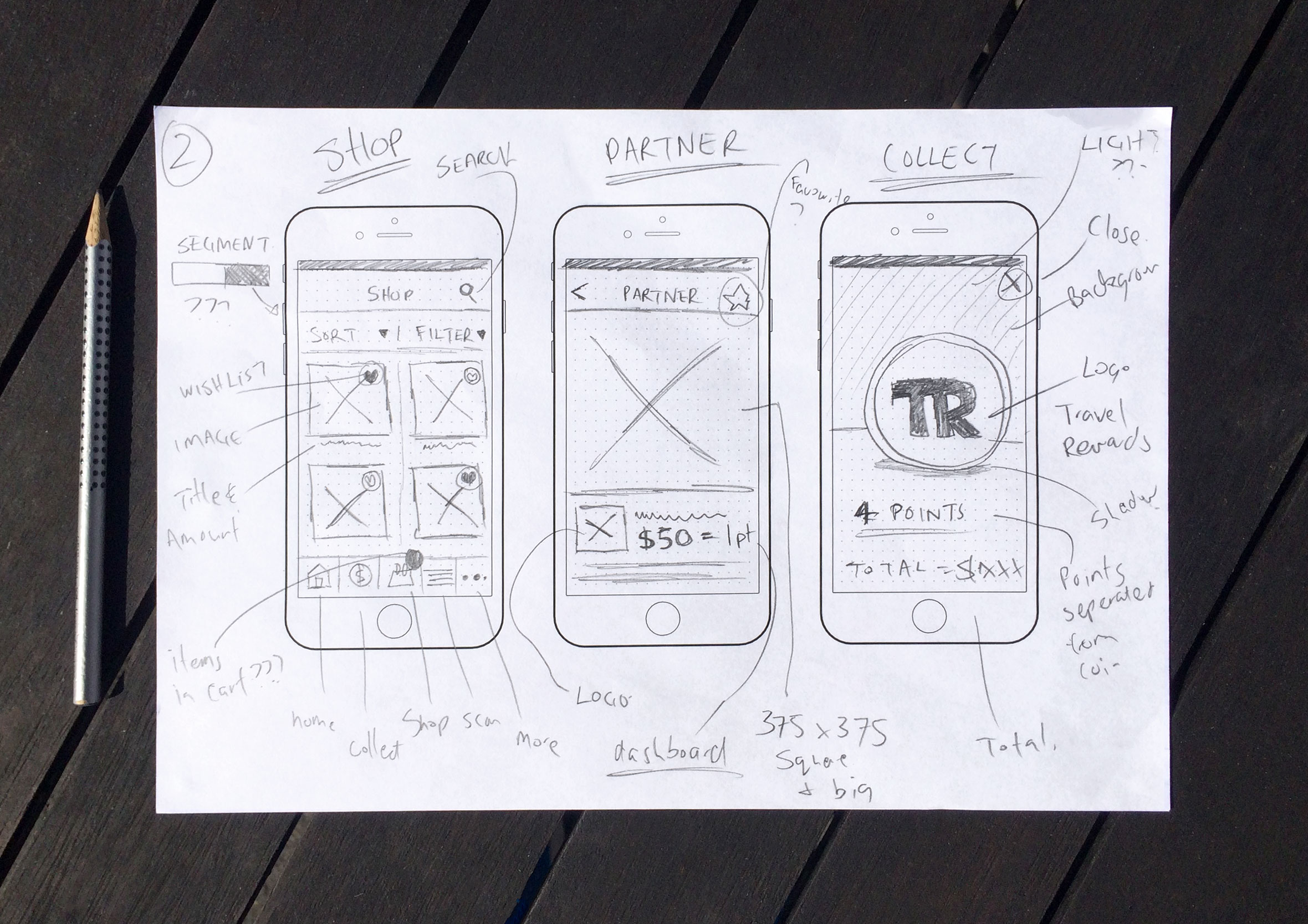
When conceptualizing ideas, I opt for a low-fidelity approach, sketching concepts with pen and paper to generate a multitude of possibilities. Subsequently, I may progress to creating wireframes or directly engage in the design and rapid prototyping phase to confirm ideas and assumptions.
Information Architecture
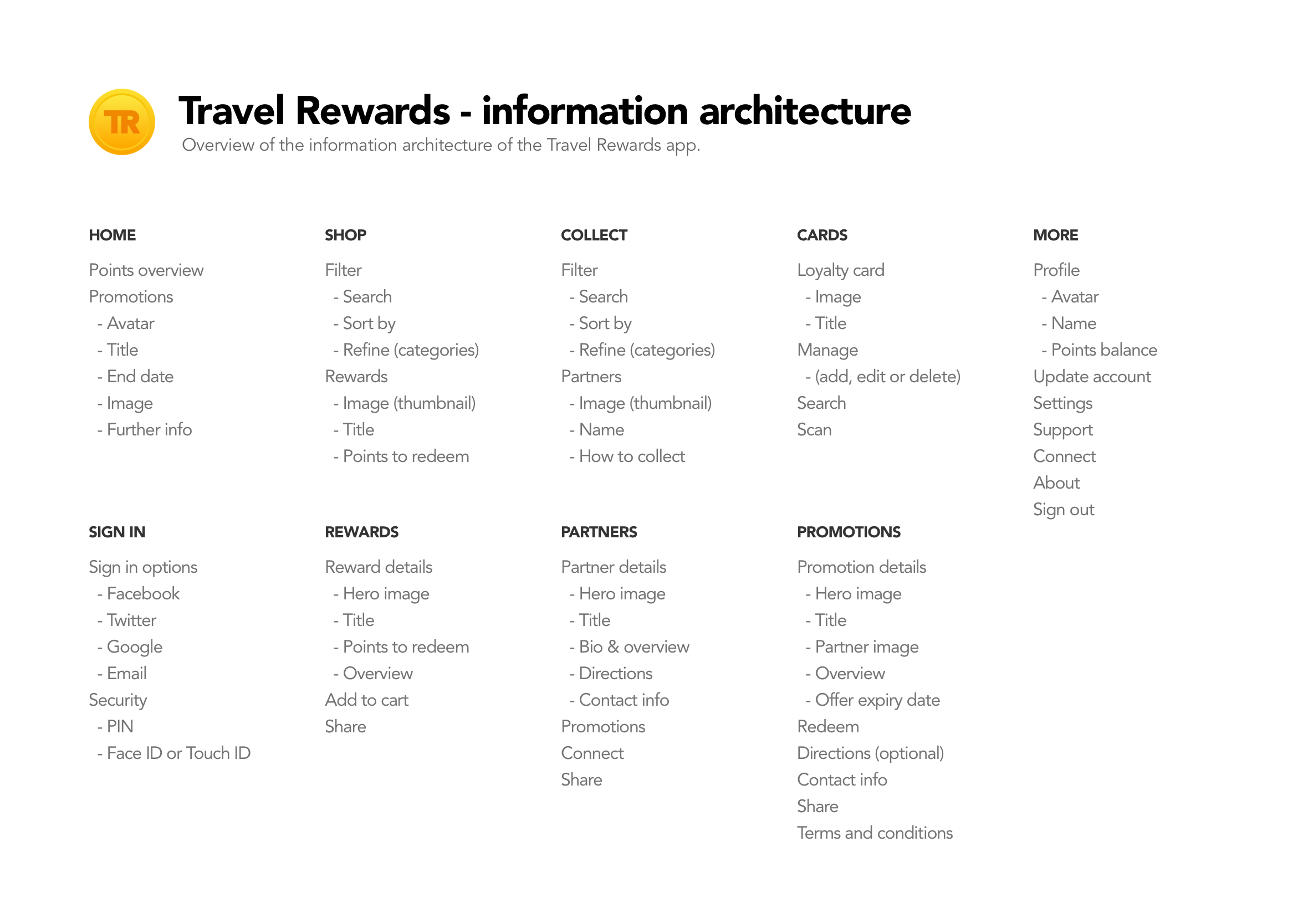
The information architecture outlines the necessary screens and all user interface components that compose the app's structure. Centralizing all this information simplifies the process of identifying areas for enhancement or gaps in the user experience.
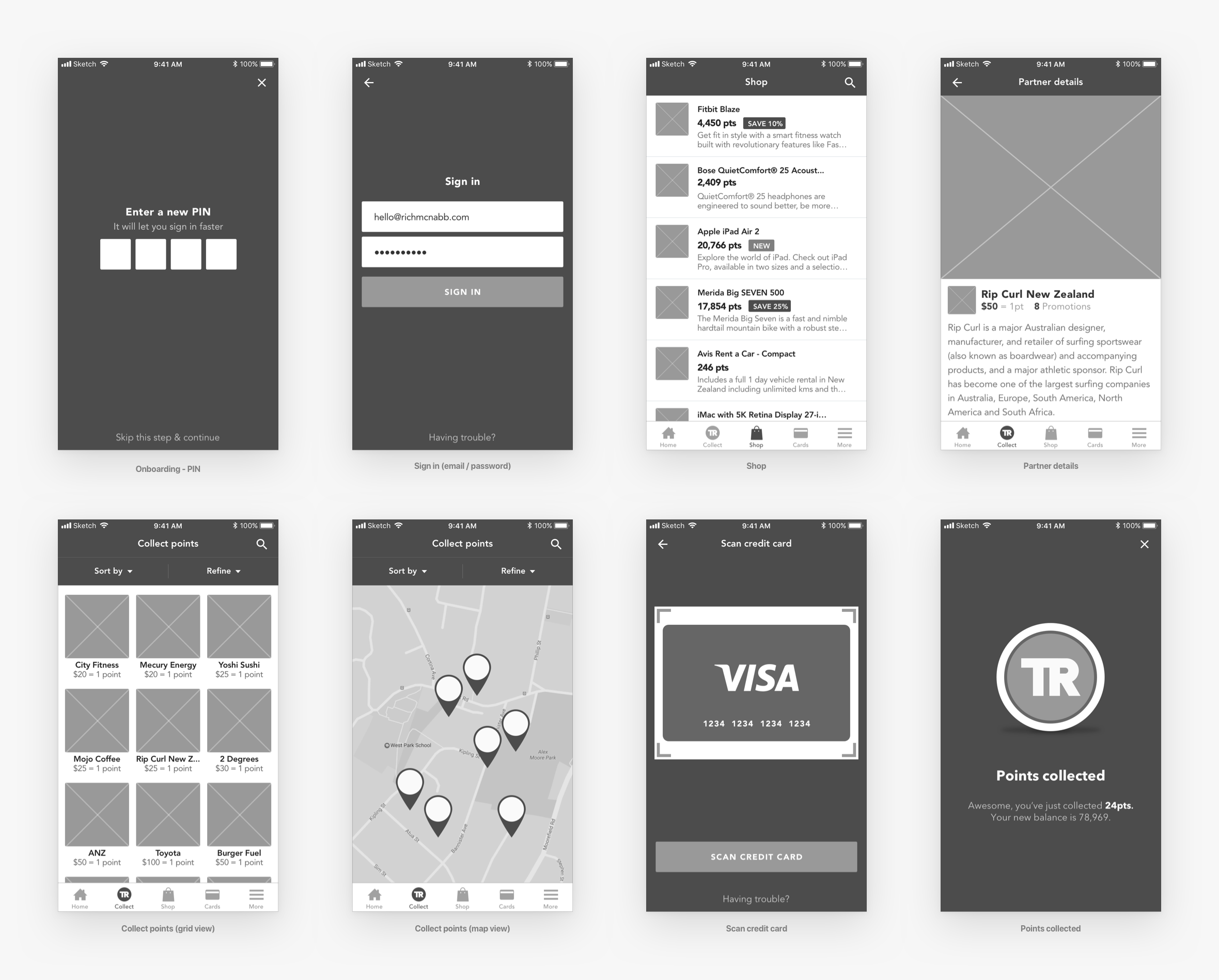
Wireframes
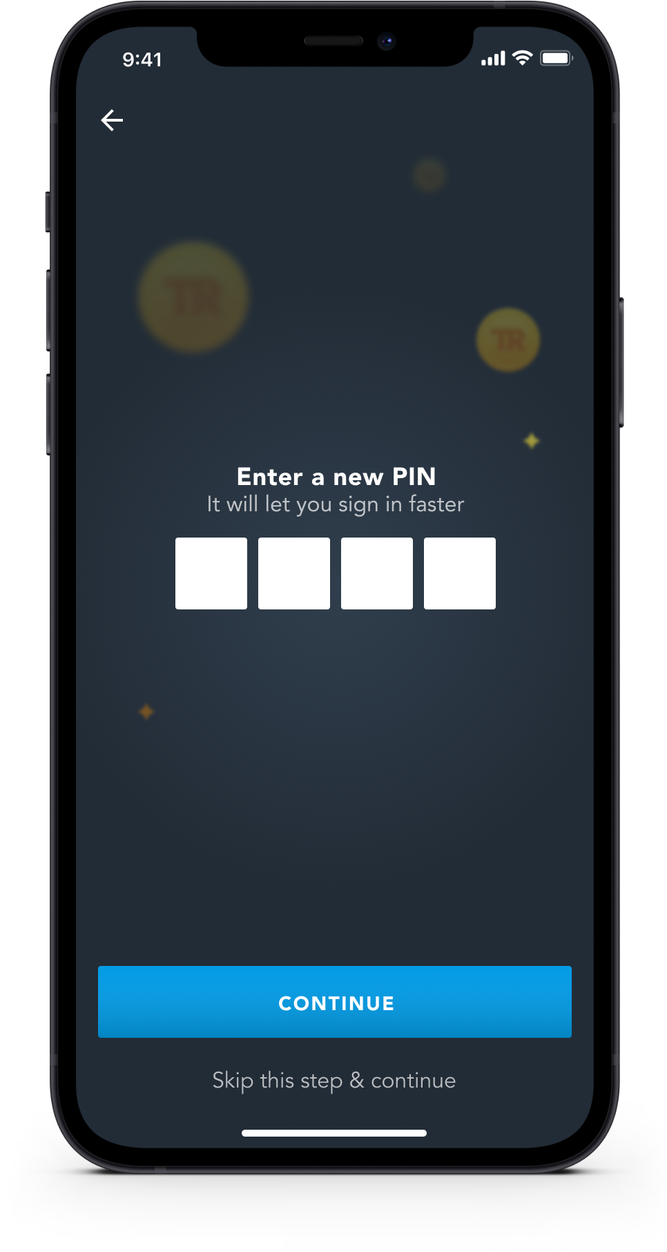
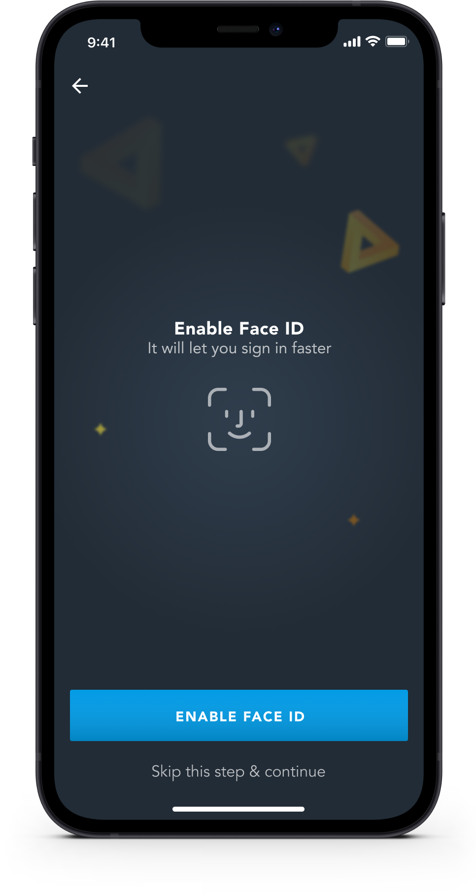
Faster sign in with biometrics
Through user research, we discovered that users faced difficulties in recalling their registered email addresses or Travel Rewards card numbers. As a response, we integrated supplementary methods to facilitate swift user sign-ins: PIN, Touch ID, and Face ID.
Promotions & Shopping
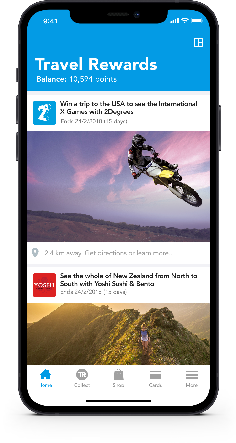
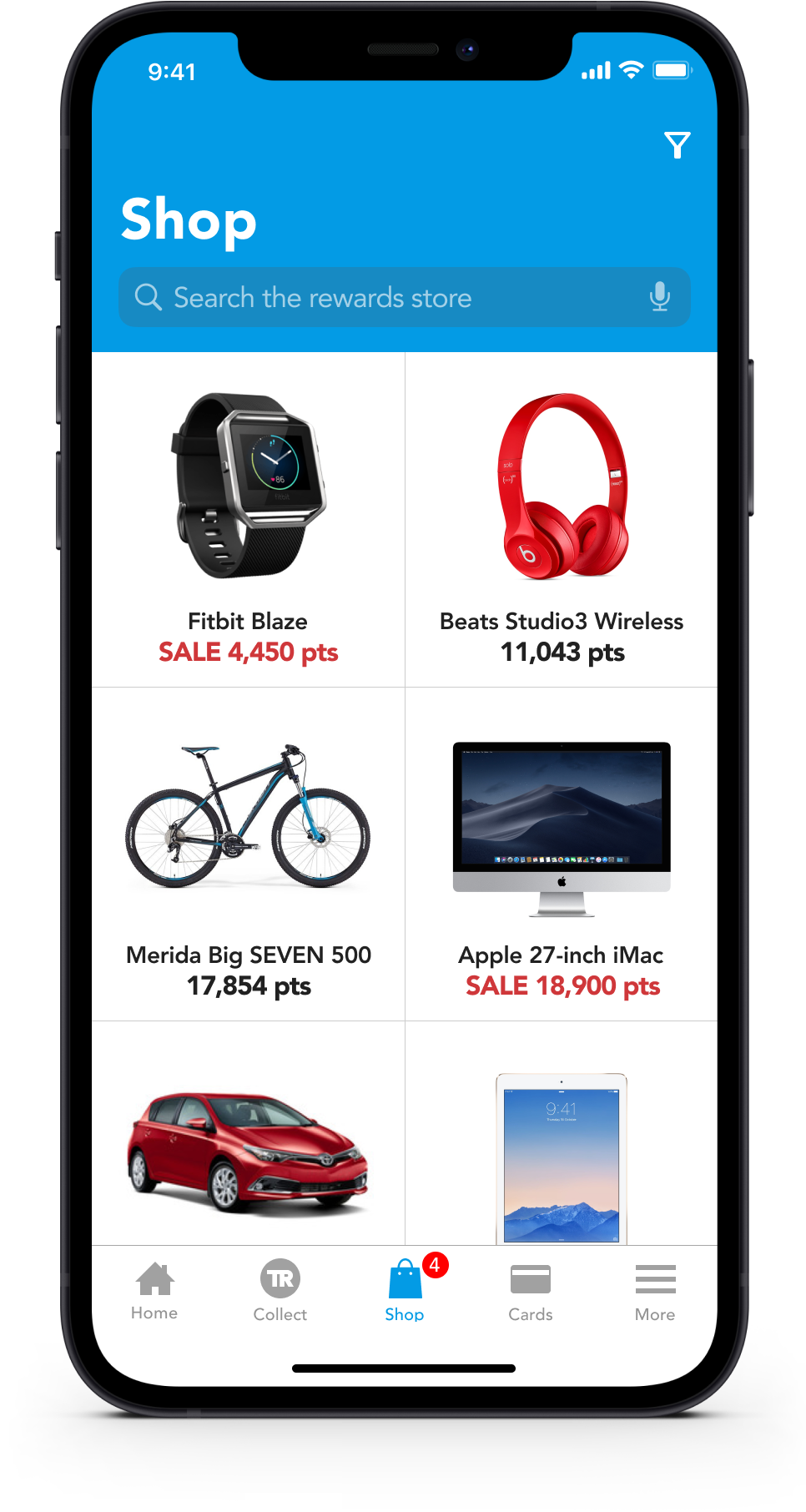
Access promotional content tailored to your spending preferences (located under the "more" section). Explore the possibilities for utilizing your Travel Reward points, offering options to browse, search, or explore categories in order to locate what you seek.
Bid farewell to loyalty cards.
Swiftly scan credit card numbers instead of manually inputting a 16-digit number into a form field. Alternatively, employ the mobile app to scan your barcode and minimize the quantity of loyalty cards you need to carry. These loyalty cards are connected to your credit cards, ensuring automatic points accumulation with every use of your payment cards.
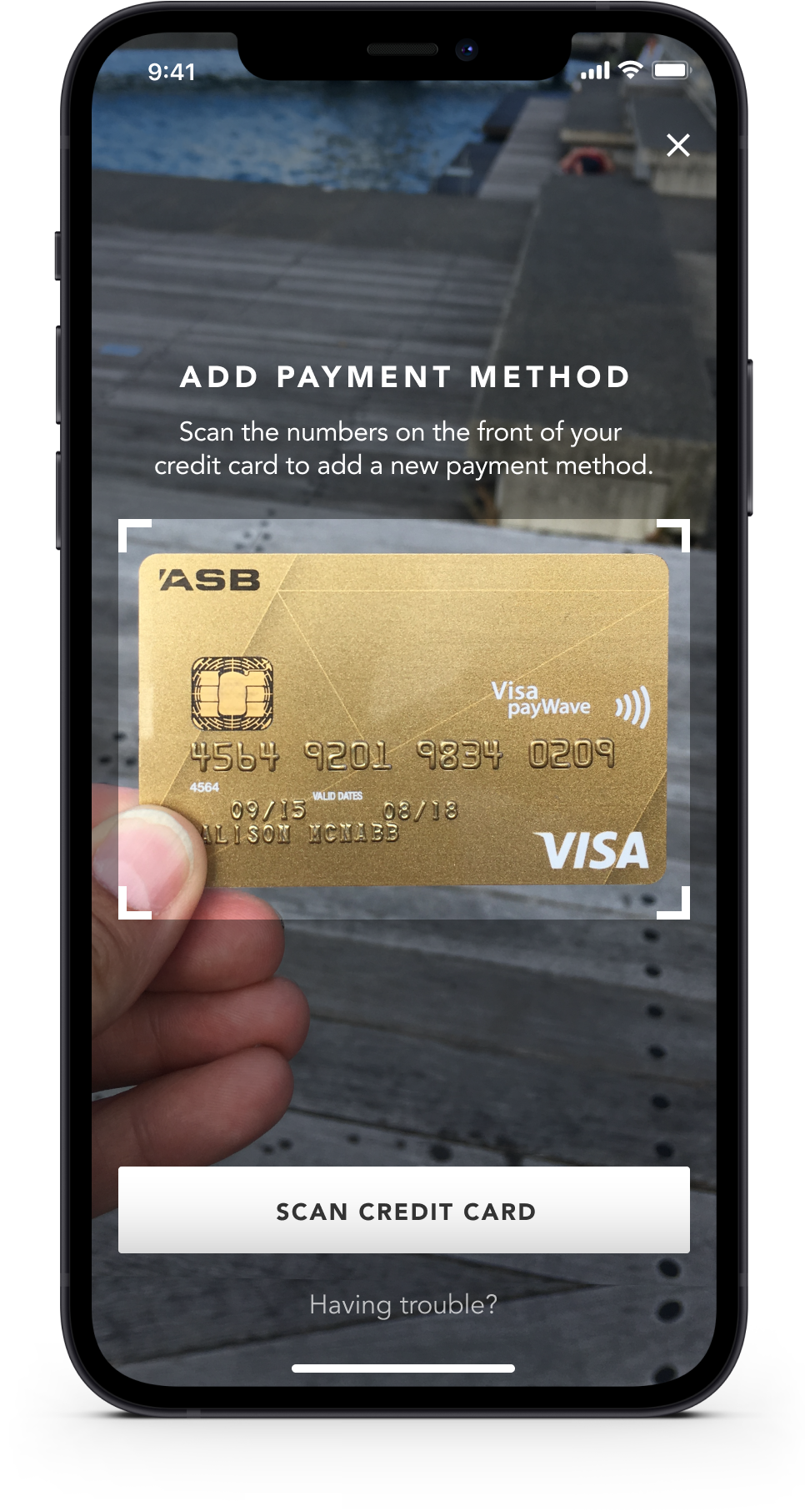
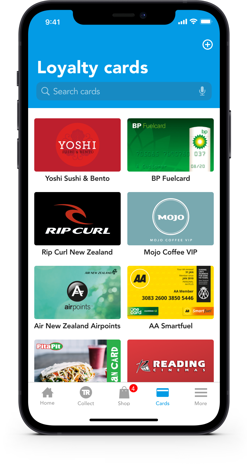
Illustration process
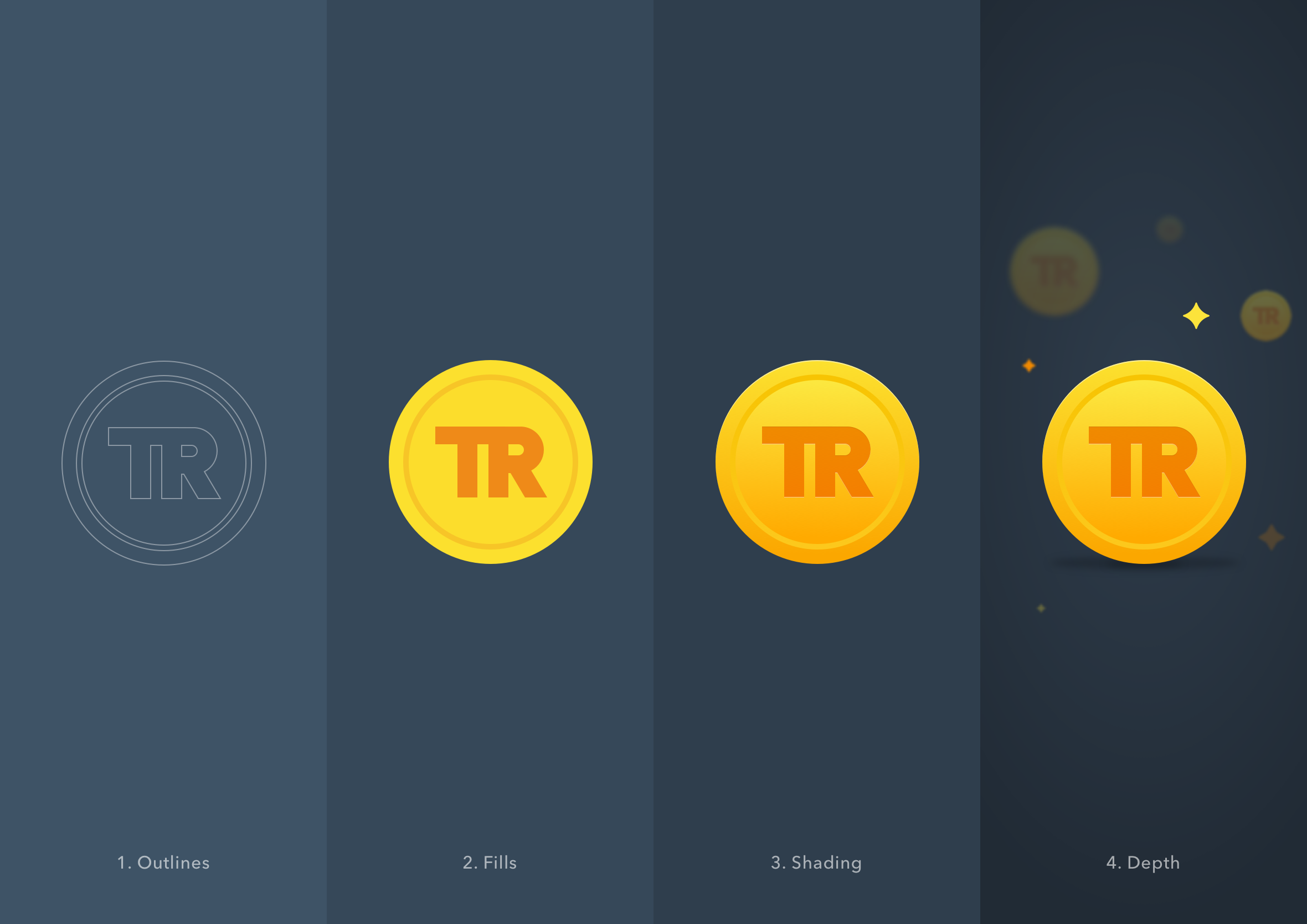
Digital design diverges significantly from sculpting in certain aspects. When sculpting, you commence with a tangible form and progressively chip away and perfect it until it aligns with your envisioned outcome. Conversely, digital design follows a reverse trajectory – commencing with a preliminary sketch, iterating, augmenting intricacies, and refining until it aligns with your aspirations. Notably, digital design is markedly more forgiving than sculpture in this process.
Product Improvements
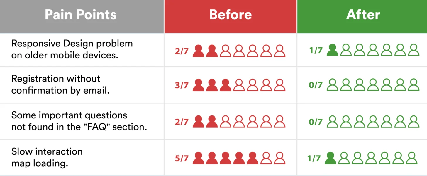
Following the finalization of the high-fidelity mockup, we subjected the platform to testing involving 7 users, leading us to identify four overarching areas of concern. These concerns were subsequently addressed in the 2.0 version of the prototype.
In response, we enhanced the responsive design to accommodate older devices, introduced an email confirmation system to monitor the user's progression from registration to suggestion submission, expanded the FAQ section to provide users with more comprehensive insights into the platform, and optimized the Google Maps API to diminish loading times.
2023 - Karthik Valluru's UX Design Portfolio. London © All rights reserved.
