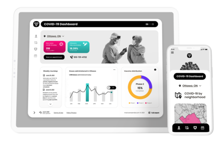
Overview
DASHBOARD
CHALLENGE
According to data from CTV News (Canada, Ontario) addresses misunderstandings over new stay-at-home rules. Residents of the province are unsure how to proceed with the data released by COVID-19.
There is a lot of information focused nationally, but the question is: How to act locally?
GOALS
- Provide useful information for decision-making at the local level
- Improve the readability of data
- Make it easier to find decentralized information
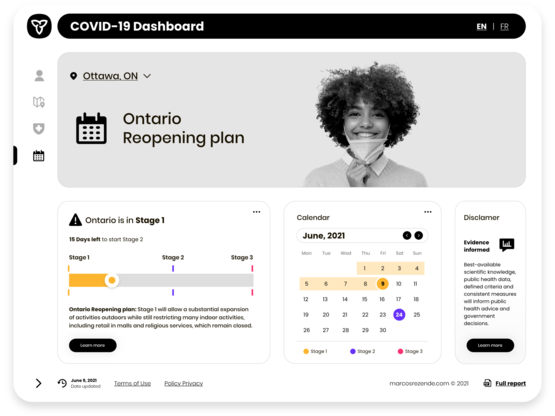
- Help Ontarians visually understand lockdown rules.
PURPOSE
The main focus of the analytical dashboard is to present data variances to the user to quickly convey critical information to users, providing one-stop information used for analysis and decision-making clearly.
Dashboard Audit & Insights
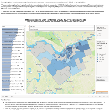
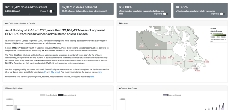
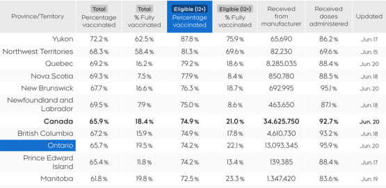
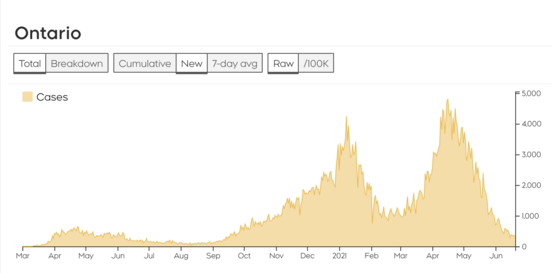
While offering relevant data, most Ontario dashboards look confusing and not intuitive. The data insights were more focused on providing a high-level overview of COVID-19 and its main indexes in the province (including data on hospitalization and death) instead of showing useful information a user can act on locally.
Analyzing the word cloud from public Twitter data about COVID-19 in Ontario was a brief method to unearth some useful insights to comprehend what people are buzzing about regarding the pandemic. This dive into the data helped me understand what's troubling people the most, including aspects like public health measures, economic impact and restrictions.

Insight Clustering
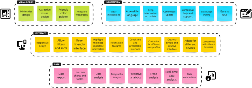
Based on the findings, I organized the major issues, turning them into potential opportunities to be explored and grouping the topics by similarity so that the requirements could be analyzed later in the project.
User Profiles
To characterize the exponential behavior of the pandemic was taken as a reference for this project the Susceptible-Infected-Removed (SIR), an epidemiological model based on socio-behavioral factors.
By doing so, I was able to utilize the model to define user profiles within three segments:
- Susceptible: people likely to get the disease.
- Infected: people who have the disease and are spreading it.
- Recovered: people who have already had the disease, have recovered, and are now temporary immune.
User Goals, Tasks, and Actions
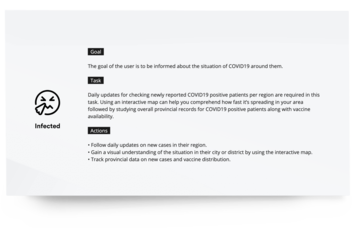
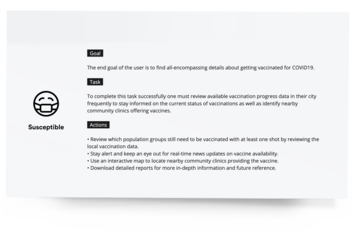
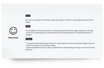
After a clear understanding of user-profiles and an in-depth application of the Goals, Tasks, and Actions method, I successfully pinpointed user intentions, determine required activities, and established necessary user paths.
Articulating these elements for the user profiles of Susceptible, Infected, and Recovered people was crucial to guiding the dashboard design, ensuring that the platform's functionalities were directly aligned with the needs and objectives of each user profile.
Information Architecture
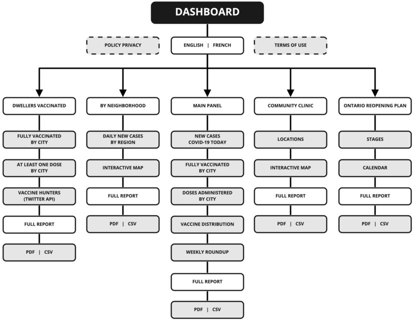
Through a comprehensive understanding of each profile's needs and goals I was able to identify pertinent features which impacted how our dashboard for information was structured. The dwellers' frequent questions dealt with the new rules, not just receiving updated information about the pandemic. Thus, it was necessary to create a visual representation to facilitate lay users' understanding of the correlation between the pandemic and lockdown rules based on the main insights.
Data representation
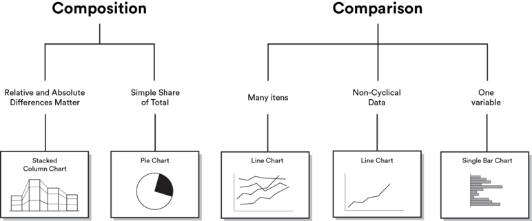
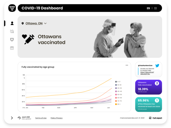
Building upon the insights gained in the previous phases, it was workable enable users to effortlessly compare multiple variables within the datasets while also providing a clear understanding of how specific data points related to the broader context. By establishing a connection between the users' requirements and the data visualization, we successfully conveyed both relative and absolute values, empowering users to make informed decisions and grasp the correlation between pandemic data and lockdown rules.
Defining the containers
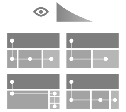
I designed the layout of the containers in a continuous flow to facilitate scanning on the dashboard, prioritizing the information in a natural reading pattern, and adhering to the Western left-to-right, top-to-bottom progression on the desktop version. The continuous flow can also improve the user experience by promoting retention, allowing the user to absorb and remember the information presented more effectively. As a result, I sketched a compelling visual approach to represent complex data sets.
Sketches
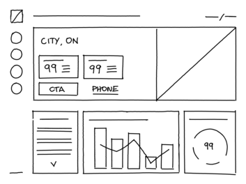
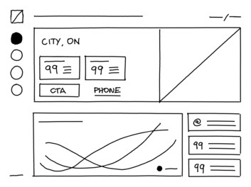
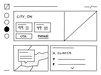
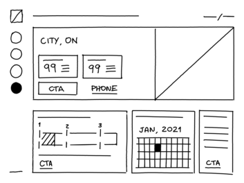
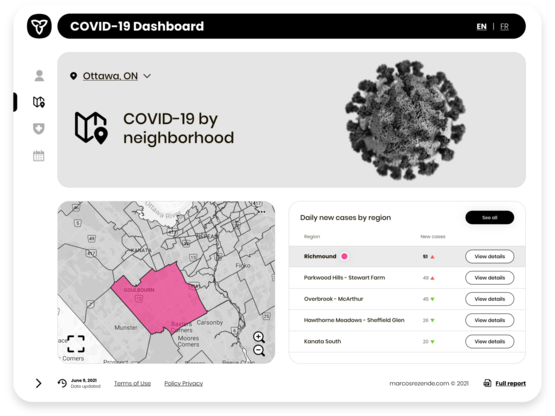
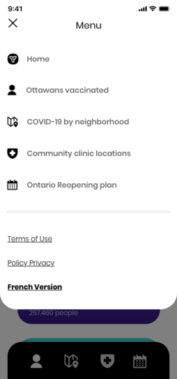
My initial assumption that a single-page dashboard could be more accessible was proven wrong upon a comprehensive review of Ontario residents' needs, as it didn't fully align with their expectations or cognitive comfort. Adopting a more organized and segmented approach became crucial to deal with such complex and deep data effectively. After analyzing and identifying various interests, I have decided to create separate menus as the ability for this solution to enable a logical separation of information and facilitate the user journey allows users to hone in on specific data clusters without becoming overwhelmed. The main focus was on ensuring intuitive navigation across these information segments.
After that, I created the sketches on the Remarkable 2 considering the data visualization principles for data storytelling. In addition, I defined the visual hierarchy to highlight the most relevant information based on the requirements. Finally, the time was ripe to focus on the interface after defining the style guide and the dashboard structure.
Style Guide
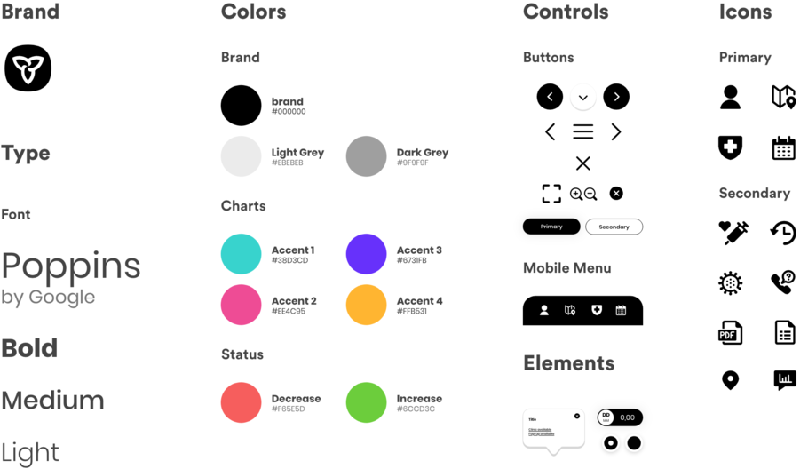
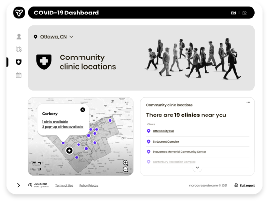
Incorporating the principles of Gestalt, this project's style guide presents a streamlined and user-centric aesthetic. Using a minimalist approach and card-based navigation enhances focus on key information while facilitating an intuitive understanding of content relationships. The design further includes modified icons from the Streamline library, ensuring a visually cohesive and intuitive user experience. The chosen monochromatic color scheme, punctuated with bright accents, increases contrast and improving readability.
User Interface
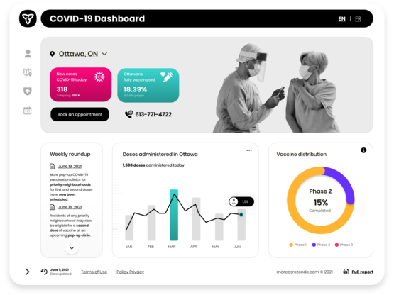
To mitigate cognitive load in order to maximize usability, I designed an interface that prioritized information using monochromatic components, which allowed us to reduce decision-making timing, thus highlighting priority content. In addition, I considered one of the Principles of Calm Technology for the layout design, which revolves around requiring a minimal amount of attention from the user, preventing the user from feeling overwhelmed with information. With this in mind, I have reduced the number of elements per session, highlighting only the essentials.
MOBILE VERSION

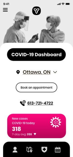
The concept project was fully responsive and customized for viewing on desktops, tablets, and mobile devices, prioritizing access to the essential elements of the dashboard through a visual hierarchy.
MOBILE MENU

Improvement opportunities
My initial assumption was that the minimalist design could easily adapt to the new amount of information coming in, as the topic was new. As a designer, I've learned that even the most minimalist dashboard often has edge cases we need to optimize for, situations I wasn't aware of at first. Therefore, by the end of the project, I came up with some improvement opportunities as a refinement:
- Integration of data from reliable sources to contrast misinformation.
- Set the extended menu menu as the default in the desktop version.
- Evaluate the requirements of vaccinated to understand how to grant access to vaccine proof system.
- Implementing in-depth interviews can bring more relevance to the project by avoiding potential cognitive biases and enabling testing of future implementations.
COVID-19 dashboard is a sample design project focused on the user-interface redesign for the available dashboards in Ontario, Canada. It's iterative work, as the topic is still incipient, and is being constantly updated.
2023 - Karthik Valluru's UX Design Portfolio. Canada © All rights reserved.

